A Study in Human-Centered Design: Postal Solutions for Aid-Workers
- Tyler Macro
- 4 days ago
- 4 min read

For my final human-centered design project, I used an iterative process to improve postal service access for deployed humanitarian workers. I conducted one preliminary survey, and one round of user-feedback sessions. I'd first identified this problem while working as an aid worker in 2022: I needed to renew my state ID, but found myself troubled by the legal grey-area which was my residential status. We lived in community buildings and churches, and maintained no permanent address other than a PO box. This made civic tasks more challenging for me, and I hypothesized it did the same for others.
Before beginning the ideation process for a digital mailroom service -- I researched, then redesigned pre-existing interfaces from varied sources across the web. I critically evaluated the chosen designs for their leverage of calls-to-action, brevity, accessibility and information organization. Through redesigning these interfaces, I gleaned valuable knowledge which helped me create an efficient and engaging app servicing aid-workers in need of a digital mailroom.
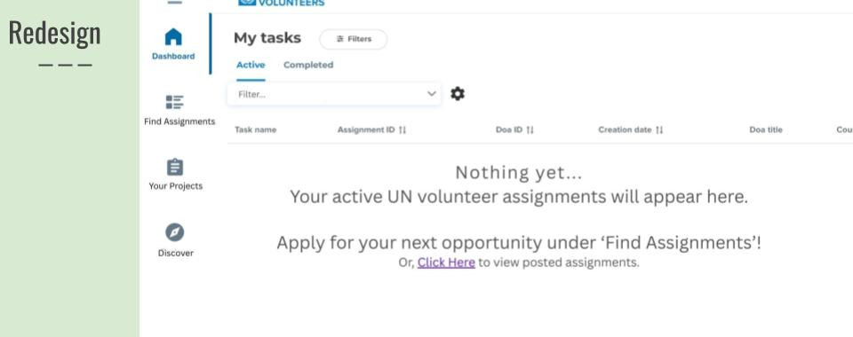
Warm Up: CVC COSS, Workspace Homepage, and Sign-In Redesign


My Design: A Digital Mailroom Service for Humanitarian Workers
First Iteration, Methodology
"In a past program it was impossible to get mail, we had no address to receive mail where we lived, so a random person in the community would receive the mail and we would get it sporadically. I was supposed to receive mail, but was a volunteer. Asked staff if they received any, it didn’t seem like they ever went to check the mail, received it a few weeks later. I had mail go missing. I never received anything important there because it might get lost or delayed. I think the experience really depends on where you are deployed/responding." ( Anonymous Respondant,"Preliminary Research: Aid-Workers and Civic Tasks")

My primary research found that the majority of respondents attributed convenience, time, and logistical challenges (accessing transportation, paying for fuel) as primary points of friction in receiving mail, or accomplishing civic tasks while on program. This provided important takeaways for the visual language, and information organization used within my design.
The original design was mostly unbranded. Organizaton within the interface prioritized utility and practical use. It was designed out of “lack” – assuming it would help users with a task simply because they wouldn’t have other, more ideal solutions. Respondents shared that receiving mail internationally is more challenging than domestically.
I will emphasize convenience and fun in my visual branding (bright colors, invoking creativity and youthfulness.) I will move the “recieve physical letter” feature, which currently is priorized as a main shortcut and 1st or second list option in my wireframe. I will instead prioritize utility for international users of the app, who seem to be the demographic most benefitted. My survey respondents identified that they do have other options, so I will further focus on “selling” the app and adding value extraneous to the core function.
In the preliminary survey, I’d hoped respondents would provide more proactive solutions in their feedback (i.e. “if I had x thing, this would be easier!”). I had also hoped they would be more specific about pain points in various processes. In the future, I can avoid this pitfall by redesigning my preliminary survey. I could also incorporate phone interviews earlier in the process, to allow for additional and spontaneous questions.
Second Iteration, Methodology
“I feel like I’m hitting buttons, looking, and then there’s not much else…” (Anonymous User, User Feedback Session)

User testing took place in person and via Zoom. 3 individuals evaluated 2 tasks each: ‘create’ an account, and view a PDF scan of mail. Of the 3 individuals interviewed, 2 were strong matches for the intended userbase (humanitarian aid workers who experience difficult receiving mail or accomplishing civic tasks). Testing went well; constructive feedback was freely given about the design and organization of the app.
Gamified, interactive onboarding
Users shared that the app felt ‘cold’ and undesirable to use. The onboarding process for new users now includes direct language, responsive answers, and engages the user in a ‘social’ interaction. This creates a more dimensional experience for the user -- they feel connected to and invested in the experience.
Survey at account creation
Streamlines customization for individual user needs. Users shared concern about rigidity of information organization, layout of app. This provides some preliminary customization, but also makes users aware that further optionality is available,
Brand voice
Alterations to color, font, and microcopy ‘ensoul’ the brand to create a more appealing experience.
Conclusion
In the next iterations – I would create a more cohesive visual brand, represent more significant options for customization, and add further detail to the microcopy and design of the “view mail” screen. All in all, I learnt that even utilitarian, tool-focussed products benefit from a warmer, more human identity and interface. When the experience is pleasant for a user, they will want to stay with and return to the app.
Although this solution could be constrained by differing legislation on a state-by-state basis, I believe it offers a feasible starting point for more accessible postal services for humanitarian workers. We could also consider that digital mailrooms are pre-existing, and mostly applied for large institutions whom process high-volumes of mail frequently (such as banks and financial institutions.) This design offers a viable template for pre-existing digital mailroom providers to diversify into a more personal or philanthropic buisness model.
About
Marin Macro is a third year undergraduate student at the University of Rhode Island -- seeking internships, contracts, or volunteer work in areas of nuclear non-proliferation, green economic policy, corporate governance, or NGO program operations. They intend to pursue graduate-level studies in computational linguistics or symbolic systems. Interests in nuclear science, climate change, and linguistics shape their education and career path. Marin a skilled communicator, experienced with brokerage support, administrative assistance. They've frequently leveraged Salesforce and Tableau to manage projects and communicate results to stakeholders.

Comments